End of Topic
With our test coming up period one here is some final revision material. Copy handed out in class.
Remember for the test you'll need to have great graphing skills - straight edges with rulers, protractor (for pie graph) and a rubber to do any corrections.
Remember that you can use a calculator (it will be way easier to find the mean or the size of the angle on the pie graphs).
The remainder of the term... We have the election results as a focal point for the next two weeks. An election is really a census of the entire population of the voting public (over 18 years old). The final 50% of your grade will be from a test/assessment done over one hour. This part of the topic will be done solo (as opposed to your presentation done in pairs). The specific things that you have to be able to do are...
Put raw data (in a random order) into a stem and leaf graph. This may be sorted or unsorted. This may be a back to back stem and leaf graph.
Calculate from stem n leaf graph the measures of the centre (mean/median/mode) and the spread (range and interquartile range).
Use the PPDAC cycle of inquiry (know what happens when and why it happens).
Draw box n whisker graphs carefully in grid paper (using a ruler and correct scale/sizes).
Read graphs to get information (histogram/pictograph/bar/pie/box n whisker).
You are allow a calculator but not the computers for this part of the topic.
PPDAC Inquiry Summary
Now that you've had enough time to look at the database of movies from 2012 and 2013 it is important for you to consider the bigger picture idea of inquiry.
So owners of movie theatres are very interested in what movies are coming up. The term "blockbuster" is great it means lots of people going to the movies and more $$ for the owners.
So the initial investigation would be on assessing which year was better or if things are getting better or worse?
Remember that you presentation will need to have some slides that cover all of the PPDAC sections.
·Problem – I will give this to you "I wonder if 2013 was a better year
financial at the box office for movies". You can make
a prediction which year you think might be better just looking at the databases.
·Plan – I got it from a website called box
office mojo. There was way more than 100 movies but I picked the
top 100 - but I choose to limit to the top 100.
·Data – Explain how you picked your sample. What is good about the size of the sample you choose. Also note that the data is in US dollars and rounded to the nearest million
dollars.
·Analysis – You have to find statistics like the middle
(mean/median/mode) the spread (range and interquartile
range). You have to have some graph(s) Box n
Whisker and/or Back
to Back Stem n Leaf
Sampling Avoiding Bias
There are too many movies here for us to process. We need to pick a smaller sample so we can easily find the measures of the middle and the spread of the data.
So how do we pick our sample? Answer we choose randomly. Technically random means every part of the population has an equal chance of being picked.
Here is how to do a random sample. Give every part of the population a number (the movies are numbers 1 to 100 already).
Use a random number generator (10 sided dice will do this - first roll is the tens and the second roll for the ones).
Here is an online ten diced dice roller. It is showing two dice a two and a three meaning the number 23 (on the movie database for 2013 that's the movie Evil Dead which raised $54 million dollars).
Question - Can we double count? If the random number 23 came up again should we have Evil Dead appear in our sample twice? Answer - No we just ignore the repeat. It catches out students because they often forget to replace the ignored one.
We are aiming to have a big enough sample to be more accurate (too small and it can lead to bad conclusions).
Recording our Data - It takes a long time to write out the names of the movies. So instead to show our selection just use a highlighter to help you remember which ones you picked. That way the only things we have to use in the calculator (or spreadsheet) are the actual numbers.
Mark Scheme Here is where I will be allocating marks (50% of this topic's grade). The other 50% is on a end of topic test.
Communicating your thinking clearly (that you've appreciated that the results will vary). Max mark 3. Looking at the words on your presentation under each PPDAC heading (you don't have to deviate much from the examples I've posted earlier).
Working well with your time (avoiding any last min rush jobs). Max mark 3. You've been onto the work (not just filling in time).
Presentation (make it good). Max mark 2.
Use of the PPDAC headings in your presentation (see below for more hints). Max mark 1 (if you have you get this)
Mistake free working (showing working out). Max mark 1 (if you show working you get this).
Teamwork (not just relying on one person). Max mark 1 (if your class presentation is shared equally you get this - no just one person talking).
Thinking outside the square (big picture ideas). Max mark 1 - if I can see that there.
Which Year Was The Best For Movies The next step in our statistics unit is to think about how we sample from a population. For this I am going to supply you with a database of the top 100 grossing (that means $$$) films of two years 2012 and 2013.
The key learning is...[the words in red are words that are vital to know/use]
We often have too many numbers to deal with - so we pick a smaller sample from the population. This is called sampling.
Sampling can easily cause bias (remember b.s.) so we have to be fair in picking. We can be fair by choosing randomly.
We still look to 'clean' any data - is there clearly an error in there. FYI there isn't in this database I've given you.
We are still focussed on the PPDAC inquiry cycle.
To get your head in the game here are two youtube clips of the big movies of both years...
Here is a copy of the list that of the top 100 for each year (it goes on two pages). I've put them into alphabetical order. The numbers I've rounded to the nearest one hundred million dollars to put the value of these in perspective the entire NZ economy for 2013 was worth US$180 million dollars so that means a movie like Ice Age : Continental Drift was worth nearly as much as the entire NZ economy!.
PPDAC On Ford v Holden Guys - I'm away again today and tomorrow with some deputy principal jobs that I've got to have done. I'm a bit worried about where you're at with your projects - this post is hopefully going to have you back on track...
PPDAC
A for Analysis... this is where you need to be processing your 30 numbers for the Holdens and 30 numbers for the Fords. The main things that I need for you to have done are...
Stem and Leaf Graphs for the numbers... e.g. this graph shows some car odometers (how many kms travelled). You can see that we're talking about 1000's of km. So the top car has 159,000km on the 'clock' and there are three cars that have all travelled 190,000's of distance.
[I would recommend rounding of big numbers to the nearest 1000]
The next calculations that you will need will be the measures of the middle.
Mean = total/number = (159 + 162 + 168 + 173 ... + 193) / 15 = ???
Median = very middle number = 180,000km
Mode = most common (in my stem n leaf graph there is one mode) = 173,000
The next calculation is the spread
Range = highest - lowest = 193 - 159 = 34,000km
Then you need to find the upper and lower quartiles.
note - this is worthy of your time - it is the most technical part of the PPDAC cycle. You can find extra support examples of this further down these posts.
The Graph(s) You can do some histograms (bar graphs with no gaps)...
OK Review Of Where You're At
In your pairs now you should have taken some time to think about how to approach this idea of whether Holden or Ford owners *love* their cars more.
I've deliberately picked the word love as it's means different things to different people (and therefore you may have different ways of approaching your inquiry). This is fair too as Statisticians get paid to work for clients and sometimes those clients will ask for things that aren't too specific.
I'm expecting that you've began to give some definitions (spelling out exactly what you're doing). There are some key things to cover - who/what/where/when. I.e. if you data comes from Trademe Website - you need to state this. If you're looking at price there are several to go from (current bid, reserve price, buy now price, 'or nearest offer' price). You need to specify these - justify which one you're picking.
I'm also expecting that you've been looking at the data - how much is there? How many XR6's are advertised? Can you use all of these? If too many you will need to sample (pick a few) - how are you going to do this (spell it out in your presentation)?. How does this compare with the Commodores? Are all the XR6's the same (if not why not) - how are you accounting for these? This is an important aspect of the PPDAC cycle as if your data is bias from the start it will lead to bad conclusions.
You want to think about your overall presentation (I'm thinking most pairs will do a PowerPoint - but that is not necessary the case). Try to balance your time - don't get sucked into spending too much on making things pretty and sacrifice your actual processing time.
From here you should start to think about finding the measures of the middle (mean, median, mode) and the measures of spread (range, upper and lower quartiles).
PPDAC Inquiry In Pairs You have to come up with a logical approach and conclusion (using the PPDAC cycle) to the following idea...
I want to know if Holden Commodores or Ford XR6's are really loved more by their owners.
Problem (was given last post)
Plan - In your pairs you have to come up with some definitions...
How will you know you're comparing fairly (ie not all old Fords versus new Holdens)?
How will you quantify the "love" (this is possible to do sort of).
How will you find your data?
What will your data be (discrete/counted or continuous/measured)?
How many pieces of data will you need?
Data - One of the two of you will need to write down all of the data (probably in order), maybe rounded, perhaps using a table and or a stem n leaf graph.
Analysis - Finding the mean, median, mode, range, upper and lower quartiles. Doing some graphs - box n whiskers, maybe scatterplot, maybe bar graph.
Conclusion - you will need to make a presentation (poster or powerpoint) to the rest of the class which will answer whether owners love Holdens or Fords more.
Marks will be allocated for...
Communicating your thinking clearly (that you've appreciated that the results will vary).
Working well with your time (avoiding any last min rush jobs).
Presentation (make it good).
Use of the PPDAC headings in your presentation (see below for more hints).
Mistake free working (showing working out).
Teamwork (not just relying on one person).
Thinking outside the square (big picture ideas).
You will have four class periods in which you can do this inquiry project. Presentations will be on Friday 5th September.
The Range
The range is the most basic measure of the spread of data. It shows how consistent the data is.
When we look at the data from our dart throwing...
We can see that although Paea's average (aka mean) was the highest he was not consistent in his scores. The range is like the measure of consistency.
Technically the Range is = Highest minus Lowest.
In our data Baylees Range is 18 - 4 = 14, Jordan is 17 - 3 = 14, Paea is 60 - 5 = 55, Pierce is 14 - 5 = 9, Finn is 50 - 0 = 50 and Josh was 26 - 1 = 25.
A way of thinking about range is to think about a tank firing a shell.
The shell will go between the longest/greatest distance (several km) to it's shortest distance (about 50m). So the range is the difference between those two numbers (it's where the shell can land).
Quartiles
The second major measure of the spread of the data is to know about the Upper and Lower Quartiles. The names gives you the hint - quarters (25%).
To find the quartiles we have to...
Step One - Have the data all in order (lowest to highest).
Step Two - Find the halfway (median aka middle).
Step Three - Find the halfway of the bottom half of data (Lower Quartile).
Step Four - Find the halfway of the top half of the data (Upper Quartile).
Quartiles lead us into a major important graph called the Box and Whisker Graph. This is the A in PPDAC (the analysis).
Box n Whisker Graphs allow us to compare two similar pieces of data.
E.g. Holden Commodore vs Ford XR6's
Which Vehicle will last the longest before it's time to get rid of it?
PPDAC
P - Problem
P - Plan
D - Data
A - Analysis
C - Conclusion
What would be a good way to investigate which of these vehicles will last the longest before it's time to get rid of it?
Summary of Learning We have now covered the following materials...
Data - numbers Counted Data - no decimals (aka discrete data) Measured Data - yes decimals (aka continuous data). Cleaning the Data - write it down (delete and replace later). Bias Data - incorrect by intent or accident (aka b.s. data). Inquiry Cycle - PPDAC (thinking about the logical approach to an investigation) Measure of the Middle - mean/median/mode Mean = total/#counted (divide because the teacher is "mean"). Median = Middle in order (think the eyes "i's"). Mode = Most common. Stem n Leaf Graph - shows all the data. (can be sorted or unsorted).
Stem and Leaf and Middle Measures.
Today we're going to get into the basics of finding the middle of any data set.
For this lesson we're going to look at counted data (discrete).
Here is a copy of the power point of notes.
The key learning [WALT] is to know the three measures of the middle. And to also know what a "Stem and Leaf" graph looks like.
Here is the idea of stem and leaf...
you can see the stem up the middle (getting bigger and bigger) and the leaves coming off the sides (extension work is the idea of both sides coming off the middle numbers).
This is what they look like in maths...
The practice work is in the text book on pages 407 to 409 Exercise 28.7.
here is an online video for these stem and leaf plot (you need head phones for this)...
The Great Lake Fishing Competition One of the very best weekends you can have fishing is an annual Trout fishing competition on Lake Taupo. It is called the "Open Trout Tournament" - anyone can enter.
Today we're going to do our own fishing - I will bring along Lake Taupo in a can. There are literally thousands and thousands of fish in the lake/can. Each of you will *catch* a pinch full of some fish (some will catch more than others). You can find your own fishing spot (in the can) and fish there. Then we'll find out some results. There will be a prize for the best table/boat (the biggest fish and the biggest average).
The learning today is about Samples. A sample is technically a small part/subset of the population. Our sampling is random. Random means that every fish in the can has an equal chance of being caught. We have to shake the can each pick to better ensure it's random.
We are going to need a way of recording down our results for each boat. For this we need to have a grouped frequency table.
Unit Plan Here are the two main planning documents. The first one is the Statistics Unit in a way students can read it (a copy will be given to you to cellotape in your books). The second one is my general order of teaching.
Statistical Inquiry Cycle A very common thing for all people to know is how to compare groups. If I said which fish is bigger, snapper from Waihi or snapper from Whitianga? I would expect you to approach the problem in a systematic way.
We call this the "Statistical Inquiry Cycle" and it's summed up in the acronym PPDAC [you absolutely must learn this]. It is a way of approaching the answer correctly.
In statistics there rarely is the right answer. Say if we said the that average year 9 at Waihi College weighed 53.4kg. It would be very unlikely that the a randomly selected student would actually weigh 53.4kg.
PPDAC stands for...
P roblem
P lan
D ata
A nalysis
C onclusion
Here is the summary poster that shows how PPDAC is a cycle that repeats upon itself.It was invented by Auckland University Statistics Department and is the cornerstone of NCEA Stats - you can get about 50 NCEA credits directly from being good at PPDAC.
Interpreting Data From Articles/Table and Graphs A skill that we all need in modern day life is to avoid being tricked. Often people that are selling products or ideas will try and trick you using Statistics.
Advertisers know that the typical consumer (that's you and me) can get tricked. The more complicated the data the trickier it gets.
With the election campaign happening every three years in New Zealand it is very common for politicians to try and trick voters...
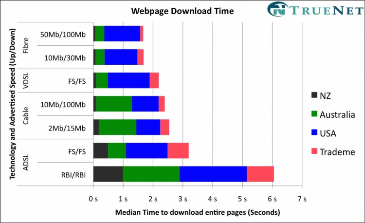
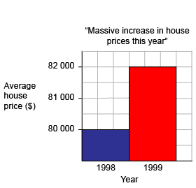
Take some time to look at this graph. Can you see what is not right about this? What was trying to be achieved here? Who do you think created this graph/advertisement?
Here is another... this shows you how complicated data can hide some silly ideas. Can you see the trick here?
Now we can work from the textbook - page 392 to 394 this is on reading data tables or some pie graphs.
Intro to Statistics
Statistics is the most vital of all the areas of Mathematics (most students that do senior maths do it in Statistics). Statistics is the most common paper taken at Universities in NZ (compulsory for Law, Business, Architecture, Medicine, Marketing degrees).
It is
a relatively new piece of mathematics (grown with the use of computers –
especially spread sheets). This is because computers can 'crunch' heaps of numbers. Imagine trying to add up manually the weights of every student here at Waihi College - it would literally take hours.
Medicine
– statistics have helped us find causes (and often cures) for diseases.e.g. the trend of death for smokers. Here is an advert that was used when smoking companies tried to say smoking was good for your health.
Sometimes statistics can trick us into wrong thinking about the relationships between (hard to prove scientifically) driving seatbelts and death. See if you take 100 road deaths probably 90 of them would have their seatbelts on. It would be wrong to assume seatbelt were the cause.
We have to start somewhere and in Statistics we start with the actual numbers. Mathematicians give a name to numbers "Data". Data is not as easy as we think.
There are two main types of data -
Counted data (discrete data) these are always whole numbers (no decimals). Sayif I asked how many times a group of people went to the movies last year - I would expect to get answer like "none", "five", "three" etc... I shouldn't expect to get an answer like "two and a quarter (2.25)".
Measured data (continuous data) these are when we do get decimals. Say if I asked how many minutes was your last phone call - I would expect answers like "three and a half" or "ten minutes and twenty seconds" etc.